Intercom’s Feature Audit
4 min
1+

If not continuously done, every once in a while it’s useful to check which features are actually used by how many people. A Feature Audit by the ladies and gents of Intercom helps sorting this out in a well-formatted fashion.
In an ideal world you should have every important data point on feature usage at hand. Reality however is that monitoring usually is not done well in most companies. But even if you can’t monitor your product’s key metrics continuously, taking a step back then and now, and pushing your product through a feature audit is pretty useful for further development.
And if you do it as the guys and girls at Intercom suggest, it won’t take much time.
First, draw a graph. On the horizontal, note how many people use a certain feature. On the vertical, note how often this feature is used. Do it like this:
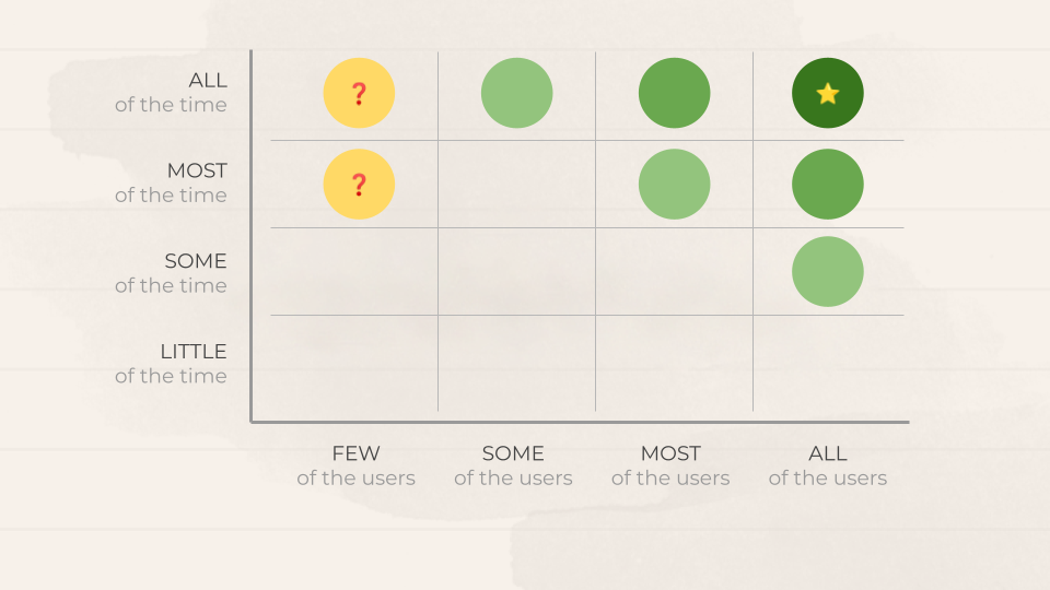
Now, define what ‘few’, ‘some’, ‘most’ and ‘all’ actually means for your product in numbers.
Then, map each feature on this matrix according to the data your data base spits out. Do ignore any administrative features such as account creation, pw reset etc.
Your product’s engine is in the top right corner. Obvious, right? This is what people actually use your product for. The more you go to the bottom left, the less useful this feature seems to be.
Features in the top left corner might be something of a special case. They are heavily used, but only by few people. Maybe they can be your features behind a paywall, and then, this is okay. Or maybe this is a small group os users with special characteristics. In any case, take a closer look on features in this corner.
Another way of looking at it is to map each feature on the horizontal and its adoption rate or usage on the vertical. This will probably look like this:
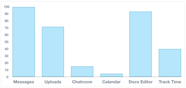
credit to Intercom
With these data at hand, ask yourself how did you get there? Be a detective and investigate why a certain feature is widely adopted and another one is frequently used. Maybe it has less to do with the feature and more with how you market it. Maybe some features are super popular, but only with certain users. Could there be other users with much more potential if you develop a certain feature a little?
What to do with it?
For any feature which is only sparsely adopted (or used) you got four choices:
Kill it:
Admit defeat, and start to remove it from your product. Particularly it is sparsely adopted and used.
Increase the adoption rate:
Get more people to use it
Increase the frequency:
Get users to use it more often
Deliberately improve it:
Make it better for those who use it
Roughly you can visualize it like this:
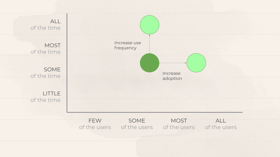
credit to Intercom
Use the 5 Why’s Technique to Find the Root Cause
To get more people using it, rank and resolve the issues that are stopping them from using it. This is where the 5 Whys technique is genuinely useful:
You might have a situation around users not using your reports feature. Why? They don’t see the value. Why? They can’t show it to their boss. Why? They can’t get it into a suitable good format. Why? Because our export tools aren’t good enough. Why? Because our API doesn’t produce good data.
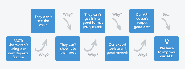
credit to Intercom
If you ask ‘why’ enough times, eventually you’ll work it out and get to the root cause. The more often you do this and to the more users you talk, you will find common blocking patterns that you can easily address. Here is an example:
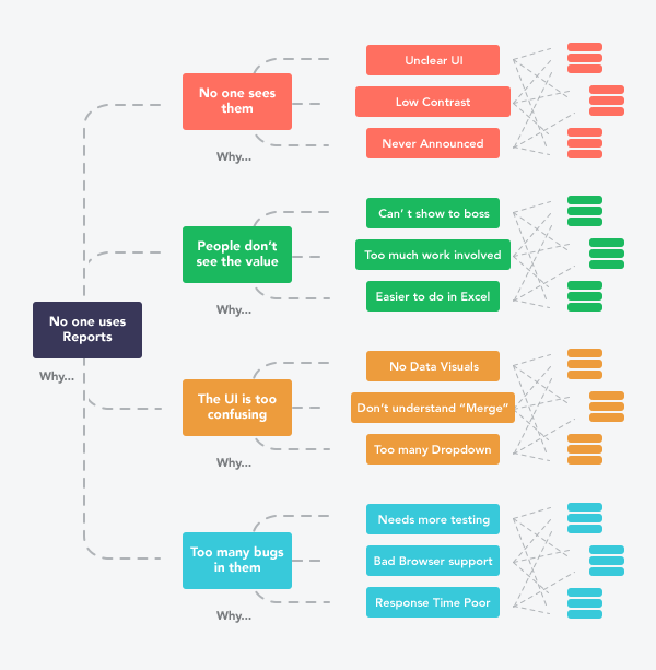
credit to Intercom
Got questions, ideas or remarks on this method? Join the conversation on